
RGB, CMYK and PMS (pantone) colors in your logo. What is the difference?
colors
Color is a complicated subject, especially for non-designers. So, if you don’t know anything technical about color yet, here’s the perfect introduction.
Want a quick overview? Download
here
an overview in pdf format.
Date
March 4, 2022
Written by
Nouchka Depotter
Tags
Colors, Corporate Identity
Logos can appear anywhere. Websites, business cards, brochures, Instagram or signs. The challenge here is to make the colors look the same everywhere. Depending on where and how a logo is displayed, one color system is always better than another.
In this article, we will discuss the difference between the two best-known color systems RGB and CMYK. There is also a third color system, namely PMS, also called pantone matching system, and we look at when this may be ideal for a logo.
1. What is the difference between RGB and CMYK?

Primarily, CMYK works best for printed materials such as business cards, flyers, brochures and signage, while RGB performs best for anything digital such as websites, digital posters and social media posts.
Depending on what the final product is, choose the right color system in advance.
But before we get too deep into it, let’s define CMYK and RGB and talk about some common mistakes you can avoid.
1.1. What is CMYK?

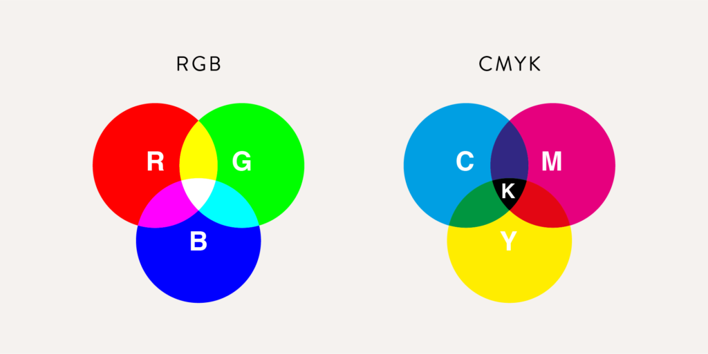
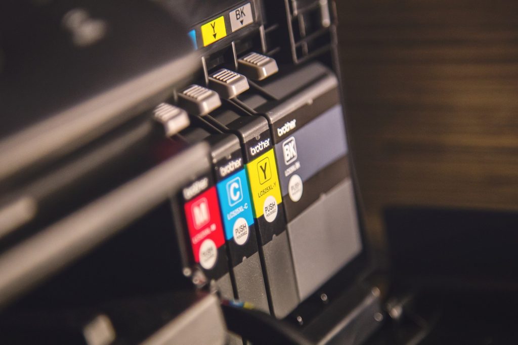
Most professional printers print with four main colors of ink, CMYK (Cyan, Magenta, Yellow, and K for Black). The K actually stands for “Key,” as in “Key Color” or “Key Plate,” and yes, black ink is usually used as the Key. Without using a pure black ink, a brown, cloudy color could result when trying to produce black by mixing the other three colors.

During the printing process, four ink plates are made for each design. The first ink plate contains only the areas printed with cyan, the second plate yellow, the third plate magenta and finally a plate with black ink to saturate or darken the other areas. Taken separately, these colors seem very limited. But when printed on top of each other, the colors work together to create many intermediate colors.

When you print, it actually prints extremely small dots (in cyan, magenta, yellow and black). The dots are so small that the eye blends the colors together.
Let’s look at the image below. If you look at the left image, you will see a typical picture. If you look at the image on the right (zoomed in very close), you can see that the detail of the eye illustrates how tiny dots are used to create this image. This was printed with nothing but the colors cyan, magenta, yellow and black.

1.2. What is RGB?
RGB stands for Red, Green and Blue. Together, these light colors make up the entire color palette on digital screens. RGB is the best choice for anything digital, such as a website, social media posts, etc.

Computer screens consist of thousands of tiny lights that can display blue, green or red light. These three lights are added on top of each other to create the color. When red, green and blue light are mixed with equal intensity, pure white is created.
A HEX color is actually the same as RGB but is expressed as a six-digit combination of numbers and letters. This is easier to copy and use in web design. You can easily convert RGB colors to HEX and vice versa.
You don’t have to worry about conversion. There are plenty of free conversion programs online.
1.3. What happens if you use the color systems incorrectly?
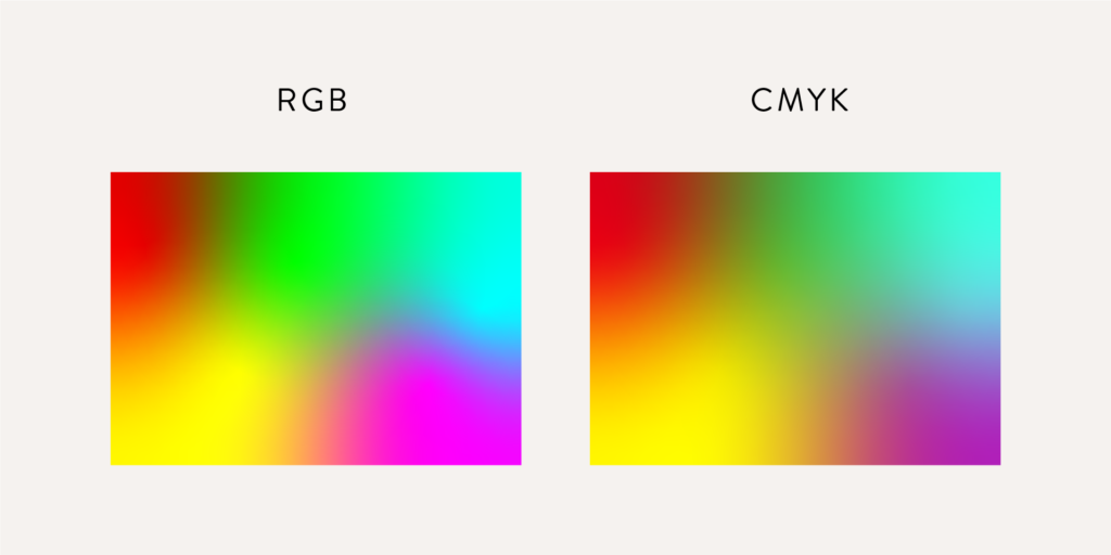
RGB can create more colors than CMYK. So all CMYK colors have an RGB variant, but not all RGB colors have a CMYK variant.
If you used only CMYK colors, photos and graphics would be much duller.

You can see above that the colors are much brighter on the left drawing. You can make a presentation, website, online ad, etc. stand out much more by using RGB colors than CMYK colors.

On the other hand, if you use only RGB colors, the printer tries to convert them to CMYK and you therefore get unexpected results.
When you need both, it is best to use an RGB color for which an exact CMKY variant exists.
2. PMS colors - Pantone colors
PMS stands for Pantone Matching System. Pantone is the name of the company that publishes color codes. PMS colors (also called Pantone colors) are standardized colors in which the ink is pre-mixed to the correct color. These PMS colors are the same throughout the world and commonly known by almost all printing companies.
When printing with cmyk, four color plates are used (cyan, magenta, yellow and black). When mixing these colors, slight differences may occur with each printing. For example, chances are that one time your business cards will look slightly darker than the next.
Pantones, on the other hand, are special color inks that look the same every time they are printed. Then in the printing process we do not use four metal ink plates, but a new metal plate is made for that color.

This does make Pantone colors more expensive to use because it costs extra money to add each new ink plate.


