
What makes a good logo?
5 characteristics of a strong logo
Date
Jan. 4, 2022
Written by
Nouchka Depotter
Tags
Logo design, Branding
Logos can be an important factor in a company’s success. A good logo conveys a lot about the company: it communicates what it does, what it stands for, what makes it unique, etc. Logos can even evoke emotions in customers.
So how do you squeeze so much information into one small picture? With a hefty dose of strategy, marketing and foresight. Trying to create one design that tells everything about a company is a big responsibility. Fortunately, there are some fundamentals that can help develop a good logo: recognition, timelessness, relevance, simplicity and versatility.
1. Recognizability
Above all, a good logo should be recognizable. Successful logos are unforgettable. You want (potential) customers to see your logo and immediately recognize it next time. After all, customers are not going to study a logo in detail only to remember and recognize it later.
Examples of clearly recognizable logos include McDonalds’ “M,” Nike’s “swoosh” and Apple’s apple. Most people can describe these logos without seeing them.
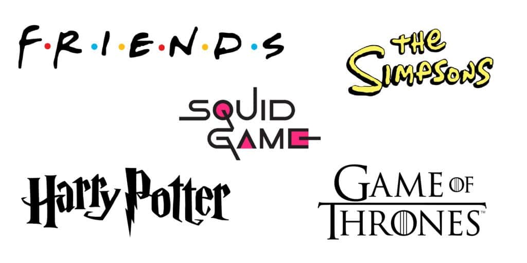
Movies and series also benefit from a recognizable logo. To do so, check your Netflix profile, for example. Each series, each film is indicated by the corresponding logo on a picture. The photo alone is usually not enough to show what movie or series it is about. The photo also features the logo so that viewers immediately recognize the series or film.
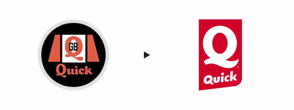
Over the years, logos are often changed because they are not recognizable enough (anymore). Take a look at the older logos below. They certainly weren’t bad logos but they didn’t leave an impression. You already have to look closely to recognize the logo. The new logos are much stronger and leave a deeper impression.


2. Timelessness
The best logos are those that stand the test of time; they remain relevant and effective over the years. Trends are nice when it comes to interiors or clothing, but trends come and go. It is attractive to create a trendy logo but this will probably need a makeover later to keep it current. This can cause you to lose customers. Therefore, following trends is not a good idea when designing a logo for a company. You obviously want your business to run successfully for an extended period of time.
For example, look at the CocaCola logo. This has lasted for nearly 100 years without any drastic changes.

We see that the Coca-Cola logo has almost always had the same font. Since 1886, there have been a total of 2 years during which things looked different. The logo is timeless. This is mainly because of its simplicity. Only typeface is used. This has a strong personality. Write any word in the font of Coca-Cola and you immediately recognize Coca-Cola in it.
The Google logo is also an ideal example. Changes were made but they are so minimal that we hardly notice the difference and immediately know that the logo represents Google.

3. Relevance
A logo serves for identification. Therefore, it is important that the logo be relevant to the market the company is targeting. A logo should clearly communicate what the company does, who is behind it and what it stands for. Let’s look at three different components of a strong logo and how each of them plays an essential role in identifying the company: colors, font and symbol (or icon).
3.1. Colors
An important aspect is the use of colors in your logo, these can evoke different emotions. For example, consider the color red in fast food chains: McDonalds, Pizza Hut, Burger King, Quick, KFC, etc.

The financial and medical sectors also use color psychology. Blue brings out the sense of confidence, stability and balance. So you notice that these industries often use blue in their logo.

And the color green evokes health: pharmacies, organic stores, natural products, etc. Therefore, the color of a logo is best not chosen at random. Colors help identify and attract (potential) customers. A trendy, new drink on the market will catch on better with bright colors or pastels than with beige and brown tones.
3.2. Font
A second important aspect in the logo is the font. Fonts help communicate the tone and values of your brand, and these in turn allow the brand to better define its personality. Whether you design a logo with a serious and sober font to define a “formal” brand, or you opt for something more upbeat and bold, fonts can be the key to effective brand recognition.


Both sentences say the same thing, but the font suggests a completely different atmosphere. Even with a logo, it makes a big difference what font you choose.
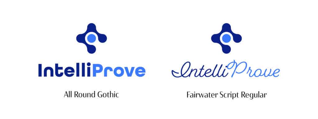
We see here the logo for IntelliProve, an innovative medtech start-up. The founders felt it was important for the logo to look innovative. Therefore, the font All Round Gothic is a perfect match. It has a modern geometric shape, making it look innovative and futuristic. Fairwater Script, on the other hand, is a handwritten typeface which gives it a vintage and classic feel. Therefore, it fits less with the brand identity of the company.
3.3. Symbol
Choosing the right symbol is a third important aspect of creating a logo. The main purpose of a logo’s symbol or icon is to convey the brand’s story to customers. The use of symbols to tell a story or convey a message is known as symbolism. We see this in traffic signs, ovens and washing machines, waste sorting, packaging, cell phones, etc. Everywhere we go, symbols are used to tell us something. Applying this strategy when creating a logo is crucial. Therefore, it does not always have to be literal. Symbolism in logo design allows you to communicate your brand and the ideas and values behind it to your target customers.
For example, Deliveroo chose a kangaroo because it symbolizes speed of delivery. After all, a kangaroo can jump up to nearly 5 meters far at a time, which gives it the advantage of finding food quickly. You can find more about the symbolism of a kangaroo here.
The FedEx logo also does not immediately show what it stands for. Yet symbolism was also used here. If you look closely between the letters E and X, you will see a white arrow. The arrow symbolizes movement and progress.

Let’s look again at IntelliProve, the innovative medtech start-up. They have developed technology to measure medical values (blood pressure, heart rate, etc.) using a smartphone camera.

4. Simplicity
Can you draw a logo in ten seconds or less? If not, that logo may be too complex to be memorable. Because what do you remember best? One digit or ten digits? The simpler the logo, the faster a person will recognize and remember it. If one chooses a complicated logo design, the message conveyed with it will also seem complicated. As a result, people will have a hard time remembering, understanding and trusting a brand.
A good logo contains a concise brand message, and this is easily achieved through legible fonts, minimalist shapes and subtle details.
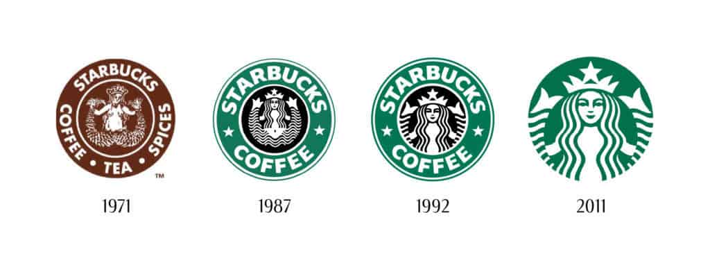

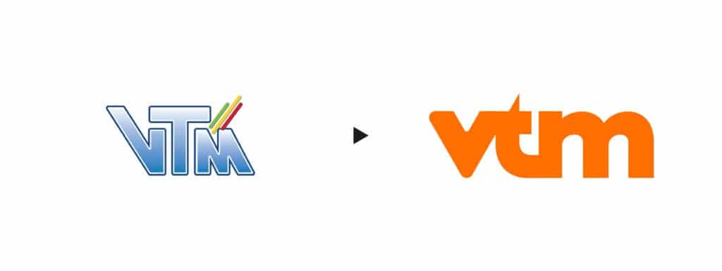

You can see from the above examples that companies are increasingly opting for simpler and simpler logos.
Take the old VTM logo, for example. Even though we saw this on TV for years, it’s hard to recreate this logo without seeing it again. This is because of the many details:
– the italic font
– the different sizes of the letters
– the three diagonal dashes on the right: different in color, length and shade
– the gradient (or gradient) in the font
– the white border around the font
– the blue border around the white border
The old logo has many details to remember and recognize. The new logo, on the other hand, is simpler and clearer.
5. Versatility
Last, but certainly not least, is the versatility of the logo. This means that the logo must look equally good in all sizes and on every support. Thus, the logo should not only impress on a large scale such as on billboards, but also e.g. as an Instagram profile picture. A strong logo is readable in all formats. An illegible logo was probably created in the wrong design or format.
The simplicity of the design will instantly make a logo more versatile. Too many lines, embellishments, elements or colors can create a complicated design that scales poorly. Instead, keep in mind that you have limited space, and focus on saying more with less. Also make sure there are different variants of the logo: horizontal variant, vertical variant, icon, lighter variant (for on dark colors), etc.

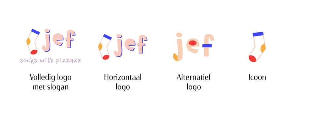

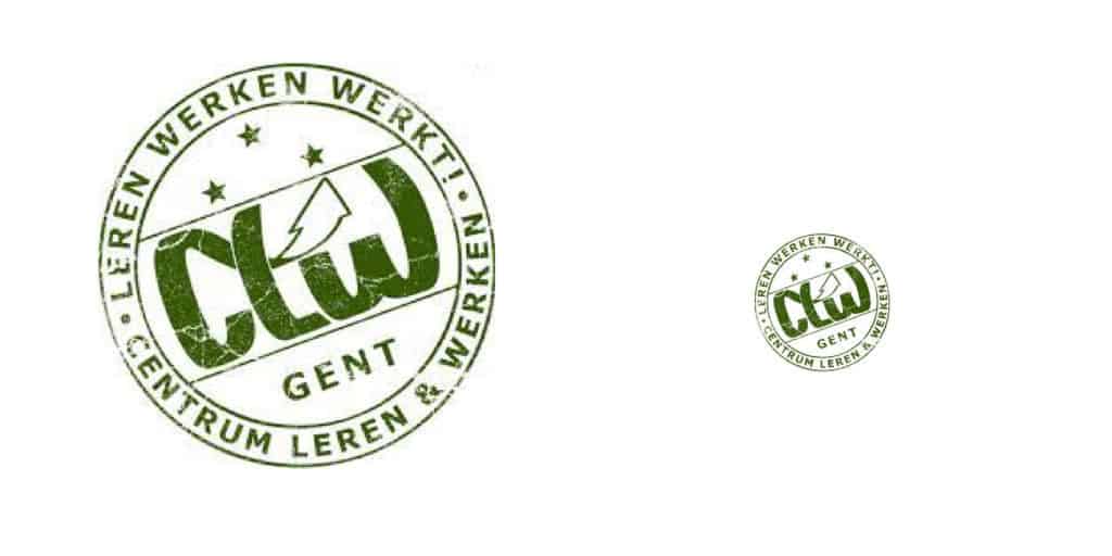
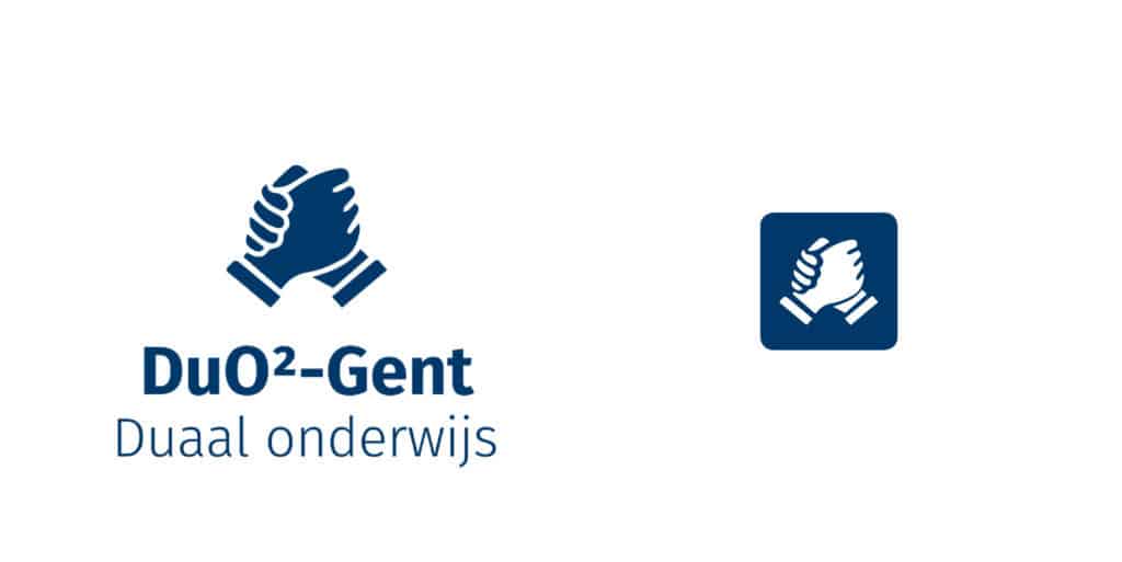
For example, look at the rebranding for the logo of a school in City of Ghent. The small logo is unreadable and cannot be used in this size.
You can see with the rebranding that it is simpler and scales better. Also, the icon can be used separately as favicon, facebook profile pictures or other small surfaces.
Even strong logos can become unreadable or unrecognizable if they are the wrong size or file type. Therefore, logos should be designed in vector format so that they can be resized to any size. Traditional photo images can become pixelated if you enlarge them (see example below) but vector files are made to be scaled.


