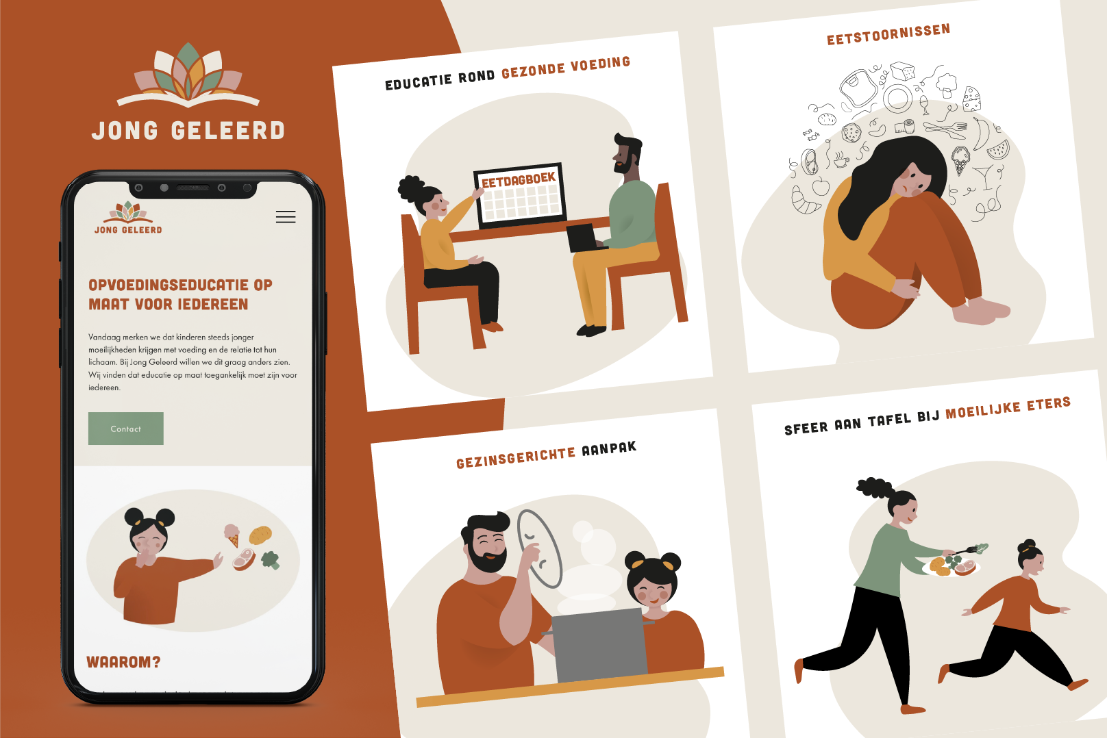
“Jong Geleerd” is an initiative aimed at promoting education and learning about nutrition among young people. Jong Geleerd helps children who have difficulties with nutrition and its relationship to their bodies. They would like to change this and therefore provide tailored nutrition education that is accessible to all.
When developing the visual identity for “Jong Geleerd,” it was essential to create a design that is both appealing and recognizable to the target audience. We wanted a design that reflects the youthful energy and enthusiasm of food, while also emphasizing the educational mission.
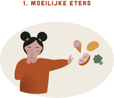
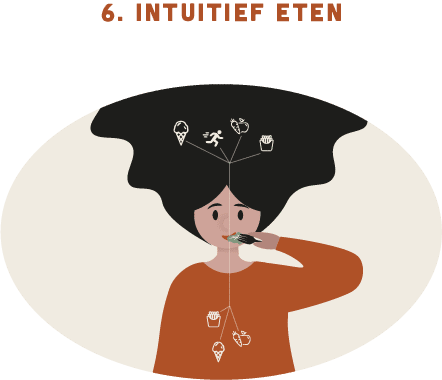
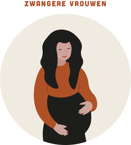
Both for the different specialties and the target audience, Zoya wanted different illustrations. The difficulty was in making the illustrations appealing to children as well as adults. Jong Geleerd especially helps children. Therefore, the illustrations must be attractive to children and get them excited. But children are not the ones who will be the first to contact or visit the website. These can be parents, grandparents or even teachers. Therefore, it was important that the illustrations also appeal to this target audience.
This logo was created by using a combination of a book, health and balance.
First of all, we have the book. The book stands for education: learning (or tutoring) about nutrition.
Next to it we have a variation of the flower of life, also called the flower of life. It is still an example of sacred geometry. The life flower symbolizes the flow of energy in the human body. It is a form of “sacred geometry” which represents balance. A healthy lifestyle can only be maintained if it is balanced or balanced. Adopting a balanced lifestyle is of prime importance because it has immediate and long-term effects on our health and well-being.
The flower is represented by leaves, which has symbolized being healthy for many years.
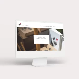
The end result is a coherent and attractive visual identity for “Jong Geleerd.” Combining thoughtful design and striking illustrations, the project is able to effectively communicate with its target audience and leave a lasting impression.